• About Joanna
  • Inspo
  • Kind Words
  • Blog
  • Rates
  • Styles
  • FAQ
  • Shop
  • Contact
  • SEARCH
Menu

Order She Wrote

Street Address
City, State, Zip
Phone Number
by Joanna Krupnick

Your Custom Text Here

Order She Wrote

  • About Joanna
  • Inspo
  • Kind Words
  • Blog
  • Rates
  • Styles
  • FAQ
  • Shop
  • Contact
  • SEARCH

Irene + Ryan's Pink Invitation Suite | June 2019

May 18, 2019 Joanna Krupnick
Marthas-Vineyard-Weddingphotography000240copy.jpg ACS_0712.JPG ACS_0709.JPG ACS_0811.jpeg ACS_0711.JPG ACS_0812.jpeg Marthas-Vineyard-Weddingphotography000297.jpg fullsizeoutput_1393.jpeg ACS_0959.jpeg

Printed by Print Icon NYC photographed by Carly Michelle planned with KG Events & Design

What a beautiful labor of love! Kristen came to me with Irene and Ryan, the newly engaged duo from NYC. We started designing this suite in January for their June wedding on Martha’s Vineyard.

The Elements of Chinese Heritage

This invitation suite was designed by Irene and I from the very beginning. She was clear that she wanted to incorporate special Chinese symbols, her heritage being Chinese! So we started with making a crest with their first initials and the Chinese symbols for “happy” or “good fortune.” In the same vein, Irene wanted to include a hot pop of red, a color of cool fortune and luck in Chinese culture. We brought that red in with the wax seal and the beautiful RSVP envelope with gold foil press.

Color Palette

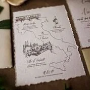
Her wedding color story was delivered in this pale pink invitation suite, with elements of cream and gold. We did the beautiful pale pink envelopes for her outer and inner envelopes, lettered in gold calligraphy. We brought in the gold with the use of gold foil in various spots all around the invitation suite. We added a gorgeous golden map illustrated by Tiffany Willey, showing off important spots in Edgartown, Massachusetts.

Florals

I especially love the small drawn bouquets of peonies and roses done by Tiffany, which Irene had made into the laser cut belly band, and wrapped it around the whole suite. Peonies and roses were the flowers used heavily in the wedding (and quite perfect with their red and soft pink color) so we brought that in to the couple’s crest used throughout the suite. We later used this same motif in the wedding signage, welcome bags, menus, and even the couple’s Thank You Note stationery. This invitation suite was done on duplexed card stock, letterpressed, and gold foil stamped.

Beauty in the Challenges

Irene and Ryan’s wedding suite tested a lot of design boundaries for me! It was the first time I had worked with clients who had a very specific picture in their heads, and throughout the process, a lot of their ideas changed. We did a whopping 11 proofs, which is pretty unheard of. The calligraphy that I used was put through a lot of changes and tweaks, which was tough. But the elements came together beautifully, and you forget all the challenges when you see it laid out so peaceful and pretty.

Courtney + Niccolo's Wedding | Florence, Italy | May 2019

April 18, 2019 Joanna Krupnick
Invite.jpg ACS_0646.jpeg ACS_0650.jpeg ACS_0649.jpeg ACS_0647.jpeg invitation closeup.jpeg

There were a few true stars of this wedding suite for Courtney + Niccolo. One was definitely Tiffany Willey and her gorgeous illustration, and another being the location and landscape: the outskirts of Florence, Italy. And lastly was the bride herself! Courtney knew she wanted the delicate, antique looking deckled edge paper (wat you call those edges when they look all rough and torn) but she wasn’t sure she wanted to invest in the quality of paper that has the torn element already there. So we bought her a paper tearer and she did them herself! That is what I call serious DIY skills and dedication.

I also loved that she was on board for adding the ribbon and wax seal element, which totally packaged everything perfectly. They were such a romantic touch, and a very ‘old-world European’ feel. I also love that she wanted to keep the airy feeling throughout the suite, and went for this very very pale grey/green envelope color with white ink calligraphy. We both thought a darker green envelope to match something similar to the green color in the ribbon would have been too much with the delicate invitation components. I haven’t been super envious of wedding guests in a long time, but I definitely felt pangs of jealousy for this group and their beautiful trip to Italy!

← Newer Posts Older Posts →
Couples love us! See our reviews on The Knot.
The Knot Best of Weddings - 2018 PickOrder She Wrote
The Knot Best of Weddings - 2019 PickOrder She Wrote
The Knot Best of Weddings - 2020 PickOrder She Wrote
The Knot Best of Weddings - 2021 PickOrder She Wrote
The Knot Best of Weddings - 2022 PickOrder She Wrote Calligraphy
The Knot Best of Weddings - 2023 PickOrder She Wrote Calligraphy

Powered by Squarespace | Privacy Policy | Copyright Notice